
2026
Redworth
Building a construction from the ground up (hope you enjoy this cringy pun).
Branding
Logo Design
Overview
A brand identity built from a family name, for a new construction company in a crowded market.
About the Project
Redworth Construction was a new construction company in Boone, NC, entering a highly saturated market. The founder had a name with real weight — strong, unique, and tied to family roots. What they didn't have was any visual direction or any idea where to start.

Challenge
Build an identity that stands out in a crowded market and reads as credible, strong, and trustworthy right away, before anyone's read a word about the company or seen a finished project.

Solution
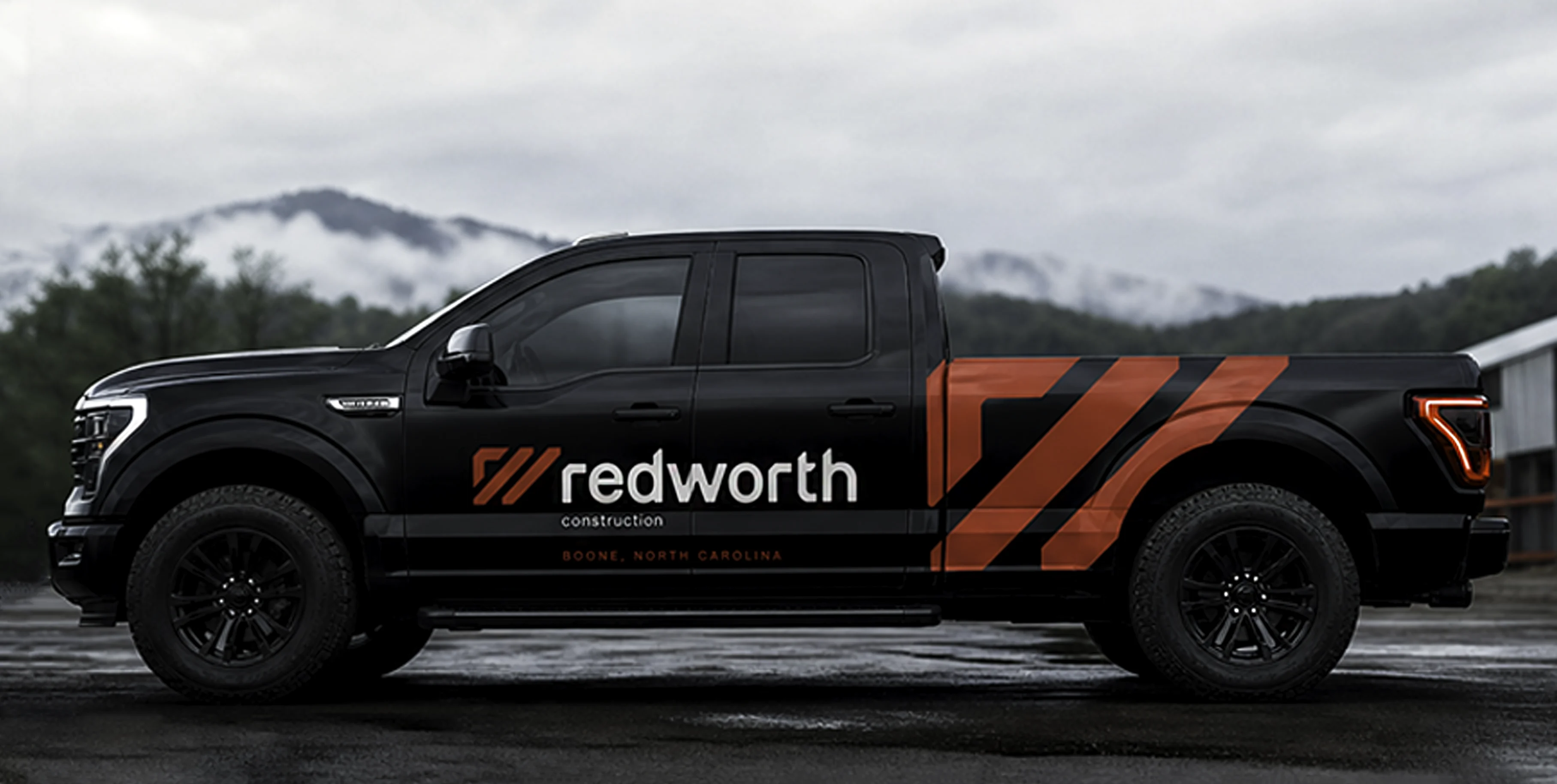
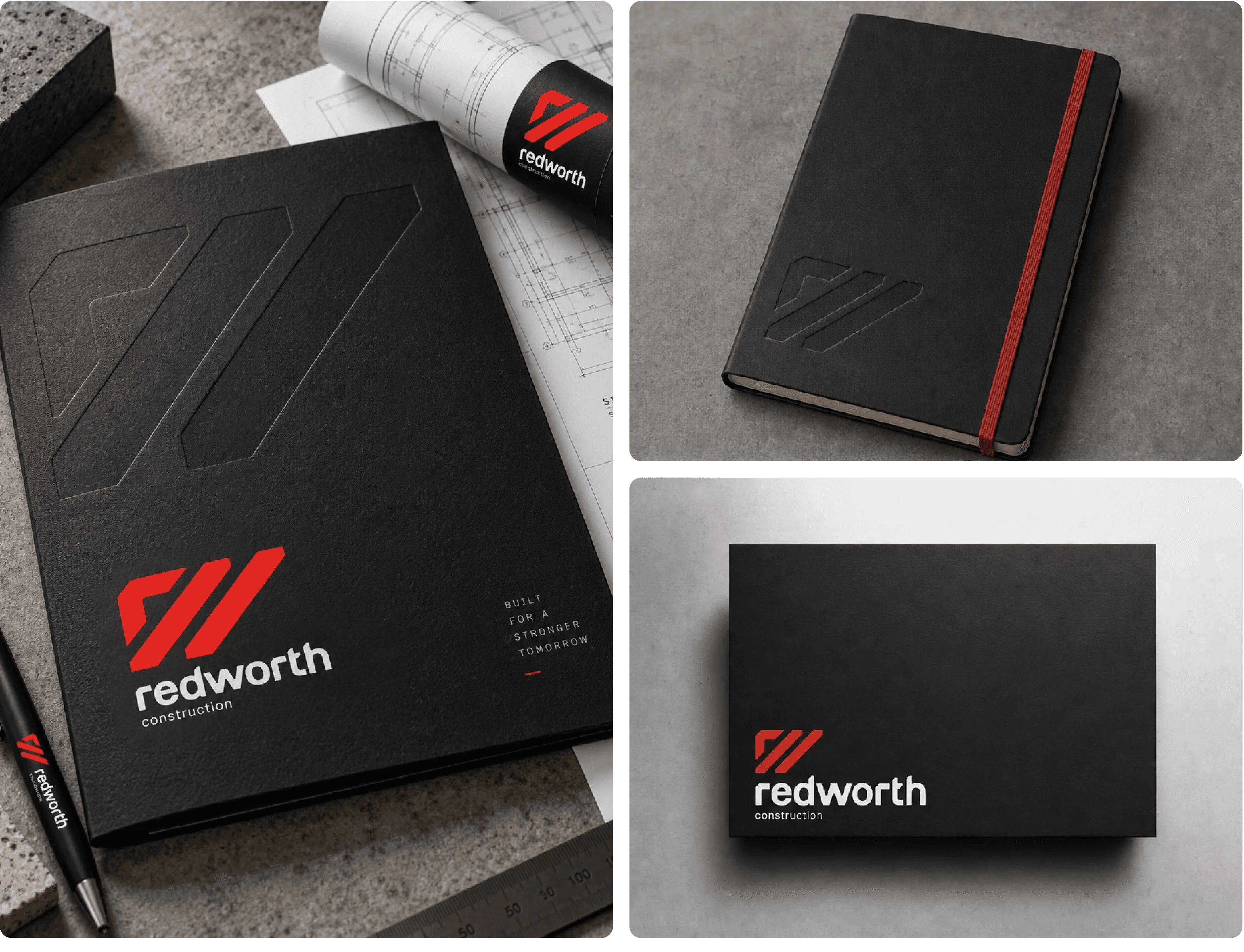
I built it around the R and the W, locking the two letterforms together into a clean geometric mark that feels structured and confident. The interlocking shapes create movement and forward momentum, while the bold angles and simplified geometry align with the precision, strength, and craftsmanship the work is actually about.
Paired with a strong, modern wordmark, the identity gives Redworth a visual presence that feels established and professional while still being distinctive and ownable — turning a family name into a brand with a clear connection to the work behind it.


More Projects


2026
Redworth
Building a construction from the ground up (hope you enjoy this cringy pun).
Branding
Logo Design
Overview
A brand identity built from a family name, for a new construction company in a crowded market.
About the Project
Redworth Construction was a new construction company in Boone, NC, entering a highly saturated market. The founder had a name with real weight — strong, unique, and tied to family roots. What they didn't have was any visual direction or any idea where to start.
Challenge
Build an identity that stands out in a crowded market and reads as credible, strong, and trustworthy right away, before anyone's read a word about the company or seen a finished project.
Solution
I built it around the R and the W, locking the two letterforms together into a clean geometric mark that feels structured and confident. The interlocking shapes create movement and forward momentum, while the bold angles and simplified geometry align with the precision, strength, and craftsmanship the work is actually about.
Paired with a strong, modern wordmark, the identity gives Redworth a visual presence that feels established and professional while still being distinctive and ownable — turning a family name into a brand with a clear connection to the work behind it.
More Projects